Exhibition of Artworks with Texture
We begin viewing a series of specific texture examples by recognized artists. Please look at the heavily textured 1989 painting called Eternity Domain done by Jules Olitski. The work is about four feet by six feet and is painted in acrylic by an unusual method.

Olitski used painter’s mitts. Those look like fluffy mittens. The fabric is similar to the nap on paint rollers. Here is how the mitten is commonly used. To paint a railing, a commercial painter or homeowner would put on the mitt, dip it into paint, then grasp and stroke the railing thus painting all sides of the railing at once.
In Olitski’s case we see the impressions of his fingers pressed from inside the mitt. Notice the gloss on his painting. Gloss is another attribute of the surface of a painting; some painters want it and others don’t. In this case the gloss gives a metallic look. In any case, gloss or not greatly changes the character of an artwork.
Are you stuck with the surface you have? No, because a matt medium can be applied over a gloss surface. Similarly, gloss medium or varnish can be applied over a matt surface. Incidentally, museum restorers use a varnish that can be easily removed with solvent, so that future restorers can remove it if desired.
We begin viewing a series of specific texture examples by recognized artists. Please look at the heavily textured 1989 painting called Eternity Domain done by Jules Olitski. The work is about four feet by six feet and is painted in acrylic by an unusual method.
Olitski used painter’s mitts. Those look like fluffy mittens. The fabric is similar to the nap on paint rollers. Here is how the mitten is commonly used. To paint a railing, a commercial painter or homeowner would put on the mitt, dip it into paint, then grasp and stroke the railing thus painting all sides of the railing at once.
In Olitski’s case we see the impressions of his fingers pressed from inside the mitt. Notice the gloss on his painting. Gloss is another attribute of the surface of a painting; some painters want it and others don’t. In this case the gloss gives a metallic look. In any case, gloss or not greatly changes the character of an artwork.
Are you stuck with the surface you have? No, because a matt medium can be applied over a gloss surface. Similarly, gloss medium or varnish can be applied over a matt surface. Incidentally, museum restorers use a varnish that can be easily removed with solvent, so that future restorers can remove it if desired.
Further aside, but still to do with coating, during the World War II Nazi occupation, people wanted to hide their national masterpieces from Nazi confiscation. Sometimes they used a water soluble opaque paint like gouache to paint an attractive scene on top of the valued painting. After Nazi inspections and the end of the war, they washed off the cover painting to reveal the valued painting underneath. I hope they took a picture of their own painting before washing it off. It must have been attractive enough to pass inspection.
A Monotype Print
Notable artists famous for their large works on canvas also made small works on paper that are little known to the public. Such is the case with Kenneth Noland. His large works are smooth, but please look at his small textured print done on handmade printing paper. Note the irregular deckled edge on the right.
This work is a monotype, which means Noland applied oil paint or thick ink to a plate, worked on it to his satisfaction, then placed the handmade printing paper on top of the painted plate and ran the paper and plate through a press. That transfers the paint onto the paper. Such a procedure is only good for making one print ‒ hence the name monoprint.
We can’t be sure of Noland’s technique, but here is a possible explanation. It looks like Noland put concentrated little blobs of mid to dark pure paint in selected places. You can’t put too much or it will get squished sideways too far when pressed. Then an off white paint in tints of pink, light green, and so on was applied on top with a square ended trowel, likely run against some straight edge jig to achieve the good alignment. Some of the colors look dragged and others squished.
There are special effects obtained in the pressing process, which is the reason why an artist chooses to make a monotype rather than a direct painting. Notice the raised snow plow effect at the edge of each band. That little curb makes a nice contribution to delineate the troweled bands that look like avenues. The raised curb is problematic based on conventional monotype technique.
It is reasonable to think, especially with monotype, that the artist can’t anticipate everything and there are bound to be some not-so-satisfactory outcomes until the experimenting pays off.
Successive Masking Painting Inward
Earlier, we discussed Jason Rohlf’s work on shop cloths (coarse inexpensive cloths used by auto mechanics to clean their hands) and we saw an artwork of his that looks somewhat like a map. Look now at another shop cloth painting of his which is about 16 inches on a side. For convenience let’s think of the colorful painted portion as a set of nested irregular pentagons.

Notice the texture of the cloth, but also the little black and white spots on top. They must have been applied after the pentagons were finished. They are a texture effect applied on top of the paint. For the multicolored pentagon painted part, do you think Rohlf painted from the outside in or from the inside out?
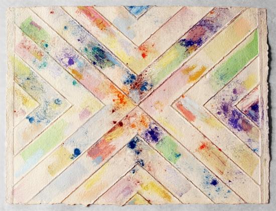
A Monotype Print
Notable artists famous for their large works on canvas also made small works on paper that are little known to the public. Such is the case with Kenneth Noland. His large works are smooth, but please look at his small textured print done on handmade printing paper. Note the irregular deckled edge on the right.
This work is a monotype, which means Noland applied oil paint or thick ink to a plate, worked on it to his satisfaction, then placed the handmade printing paper on top of the painted plate and ran the paper and plate through a press. That transfers the paint onto the paper. Such a procedure is only good for making one print ‒ hence the name monoprint.
We can’t be sure of Noland’s technique, but here is a possible explanation. It looks like Noland put concentrated little blobs of mid to dark pure paint in selected places. You can’t put too much or it will get squished sideways too far when pressed. Then an off white paint in tints of pink, light green, and so on was applied on top with a square ended trowel, likely run against some straight edge jig to achieve the good alignment. Some of the colors look dragged and others squished.
There are special effects obtained in the pressing process, which is the reason why an artist chooses to make a monotype rather than a direct painting. Notice the raised snow plow effect at the edge of each band. That little curb makes a nice contribution to delineate the troweled bands that look like avenues. The raised curb is problematic based on conventional monotype technique.
It is reasonable to think, especially with monotype, that the artist can’t anticipate everything and there are bound to be some not-so-satisfactory outcomes until the experimenting pays off.
Successive Masking Painting Inward
Earlier, we discussed Jason Rohlf’s work on shop cloths (coarse inexpensive cloths used by auto mechanics to clean their hands) and we saw an artwork of his that looks somewhat like a map. Look now at another shop cloth painting of his which is about 16 inches on a side. For convenience let’s think of the colorful painted portion as a set of nested irregular pentagons.
Notice the texture of the cloth, but also the little black and white spots on top. They must have been applied after the pentagons were finished. They are a texture effect applied on top of the paint. For the multicolored pentagon painted part, do you think Rohlf painted from the outside in or from the inside out?
Rolfe's Masking Technique
Let’s assess the situation. If you have richly opaque paint you can cover a previous layer completely with a new layer. If you started from the inside, it would be hard for you to apply masking tape to the inside of each figure then paint outward. It is better to mask from the outside of each figure. By outside, I mean furthest from the center small cream area.
So let’s start at the outside with a strip of tape masking the outside edge of the green areas. The green can be freely painted inward a few inches. Now apply masking tape to the outside of the red area, or I should say the area that will become the red area. Freely paint red inward toward the center a few inches, covering the green paint already there and dried. Next mask the outside of what will become the white area and freely paint white a few inches toward the center. Thus you keep painting freely toward the center with your masking tape on the outside of the area you are painting. Eventually you reach the center, where you paint cream.
Generalized Masking From One Side
We went through the details on this piece because that technique must be used over and over by many artists. More generally we could say this technique uses painting freely in a direction away from some form of masking. The successive masking could be inward as discussed or proceeding in some direction, like to the left or right, or any direction.
Keep your eye out for works that likely have been done by that method. I find Rohlf’s work has a stunning contrast between the humble shop cloth visible as background and the finely tailored look of the painted part. The scattered little drops and flecks on top serve to unify the two areas of the work.
Avoiding Texture
It is worth noting that some artists who emphasize the geometric shape of their work don’t want texture. Leon Polk Smith whose work we have seen said he wanted the colored areas to be like a smooth wall. Other artists whose large works have the smooth look are Carmen Herrera, Kenneth Noland, Ellsworth Kelly, and Frank Stella.
Comments
Post a Comment
You are invited to comment if you wish.