Pop Art from Comics
Later in this post we will examine some of Lichtenstein's abstract works but we will start with the pop art that raised him to prominence.
In the 1960s within the Pop Art movement, Roy Lichtenstein was appropriating images from comic books. He kept the comic frame word bubbles or changed them slightly or even omitted them.
Please see one of Lichtenstein's most valued and iconic paintings. It is called In the Car and is about 6 by 7 feet and done in Magna (early acrylic) and oil paint. It resides in the National Gallery of Scotland.
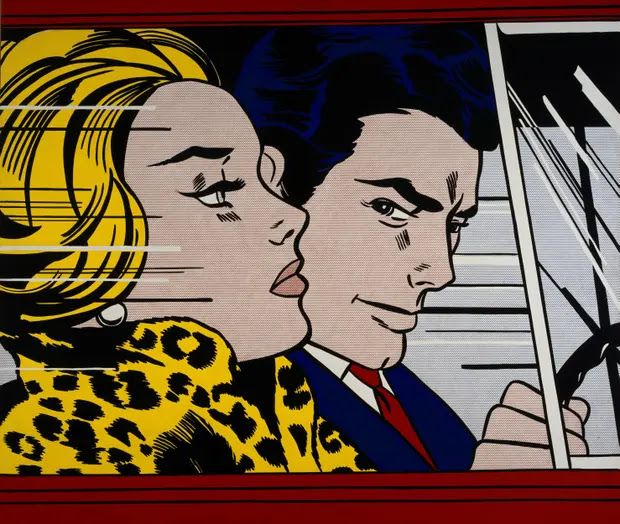
With no caption, we must guess or imagine the vexing relationship and perhaps touchy words before or after. One observer said she is cool and he has a predatory eye.
For comparison see the original comic frame by comic artist Tony Abruzzo.

In a sense Lichtenstein's painting is like an abstracted timeless snap shot of the comic book's longer story presented as a series of frames. Do you see changes Lichtenstein made in framing, colors, and hair? How did they indicate glass or movement?
Lichtenstein hand painted Ben-Day dots -- hard to see because they are so small in this work but will very evident in other works. Those dots were used in the original low budget comics to simulate intermediate colors and tones from just a few available primary color dots.
Some critics say his work lacked originality. But, he originated the idea, that is, he recognized the potential of the comics and he executed his versions well, transforming them in size and context. A favorite word for any of this appropriating is re-contextualizing. Fortunate for him, he did this at the right time when Warhol was pioneering pop art.
Another criticism is that he didn't give credit or royalties to the original comic book artists. But it is also recognized that the comics themselves didn't credit their artists.
Lichtenstein's pop comic paintings, by his own choice, are of emotionally charged melodramatic scenes like Drowning Girl (she would rather drown than seek help from Brad) or of violent action like Whaam! (fighter jet and exploding rockets hitting an enemy plane). Some see these works as caricatures or parodies.
Other, Later Subjects
Later he found other subjects to render in the comic style, like a series devoted to interiors,

another to sunsets,

and one representing an artist's work like, for instance Van Gogh's painting of his bedroom in Arles.

By the way, some of Lichtenstein's interiors are so garishly contrasty they hurt my eyes, so I chose milder ones. In fact, there are some more graceful productions. Here is a sunset using the usual principles and printed onto silk that can be used for women's clothing.

Compare it with the previous sunset. Explain why it looks more graceful.
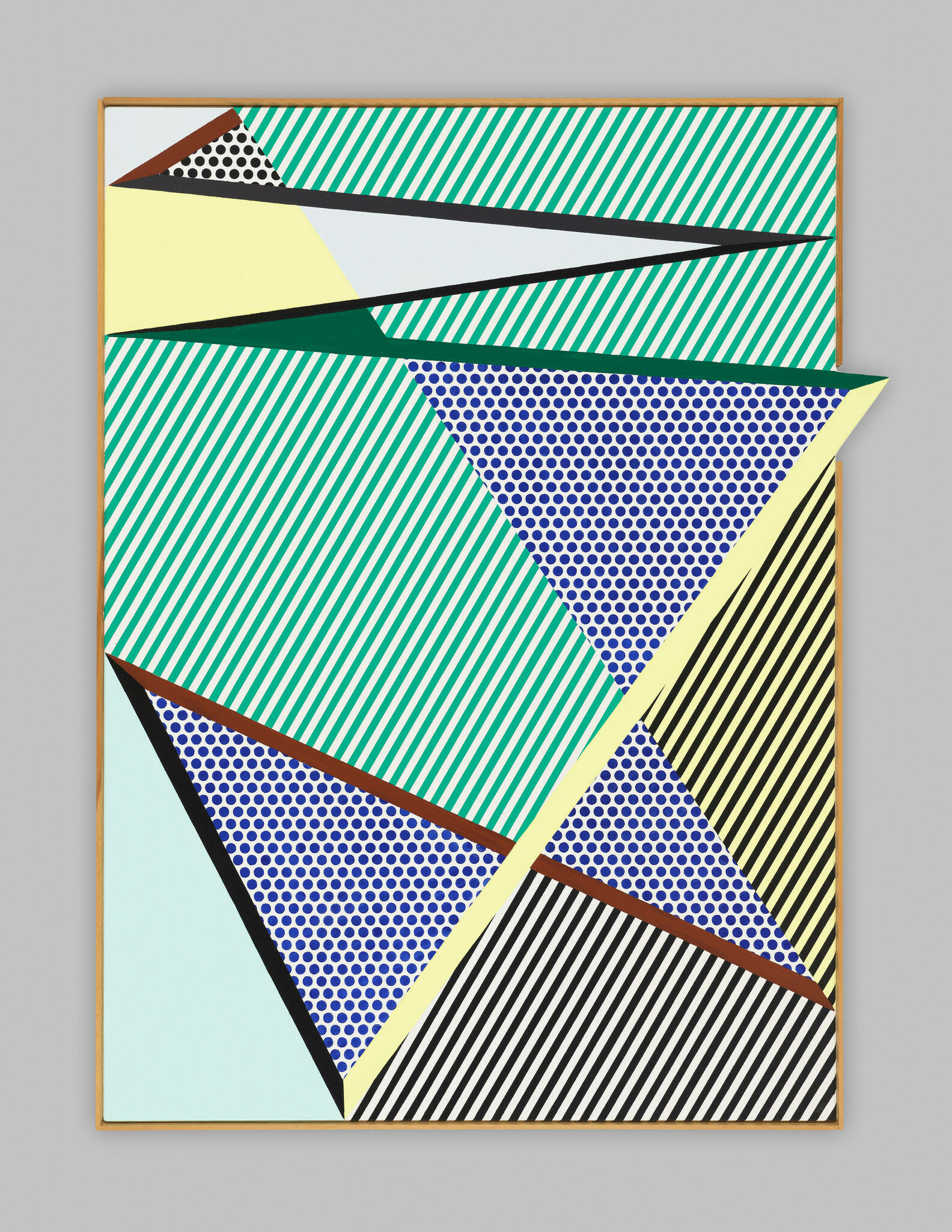
Later still, he made abstract works contained in a rectangular frame, which he called perfect or jutting beyond the frame, hence labeled imperfect.
See two imperfect paintings from the late 1980s. The first has much dot fill and line fill and is only slightly imperfect. It is at the Whitney museum. Being slight, the protrusion seems almost accidental, thus becoming amusing.
Another imperfect painting has a curve and seems like a dancing or perhaps slipping or falling star.

For comparison, see a related painting by Frank Stella from the 1960s.

Besides a sizable protrusion beyond the rectangle, it also has a cut out area. Is it good to have both? Compare and contrast with Lichtenstein.
Art always has trade offs and judgements. How much jutting out or cutting into is esthetically appealing or not? What about the painted band on the left side of Stella's work? Note that it has slanted ends. Should it be continued across the bottom?
What do you think of Lichtenstein's dot fill or line fill in regions? Are they a relief or foil to the plain painted areas? What feeling do they give compared to plain painted areas? Do Lichtenstein's works look lighter in weight? Why?
Of Lichtenstein's works shown which is the most patterned? Can a work be too complicated? In what way? What size should the fill dots be? What line width fill should be used?
My first impression of In The Car was that they were accomplices in crimes or cons. Of course the original comic strip frame makes it clear what the intent was. However, perhaps Lichtenstein prefers the ambiguity and the possibility of multiple interpretation.
ReplyDeleteA link to the Whaam! painting:
ReplyDeletehttps://media.tate.org.uk/art/images/work/T/T00/T00897_10.jpg