Accessible Collage
To get started in a gradual fashion we will examine simple paper cut out shapes placed on a plain background. See first my own collage made with various sized black open squares of paper placed to overlap thus creating interesting negative-white spaces.
To get started in a gradual fashion we will examine simple paper cut out shapes placed on a plain background. See first my own collage made with various sized black open squares of paper placed to overlap thus creating interesting negative-white spaces.

Next we have a black square with eruptions.

Think of an original black paper square that has curved cuts made into it on three sides. Then the curved pieces are expanded, that is, pulled out into the surrounding space. The effect is that of explosions or eruptions. The figure comes from a fine older book: Paper Collage by Robin Capon.
Work with black and white emphasizes bold contrast and form.
If you would like to see more or try it yourself search in YouTube for the title: TIPS - simple black and white painting. That is one of a series of videos named Imperfect Paintings all of which I have found to be enjoyable and rewarding.
Work with black and white emphasizes bold contrast and form.
If you would like to see more or try it yourself search in YouTube for the title: TIPS - simple black and white painting. That is one of a series of videos named Imperfect Paintings all of which I have found to be enjoyable and rewarding.
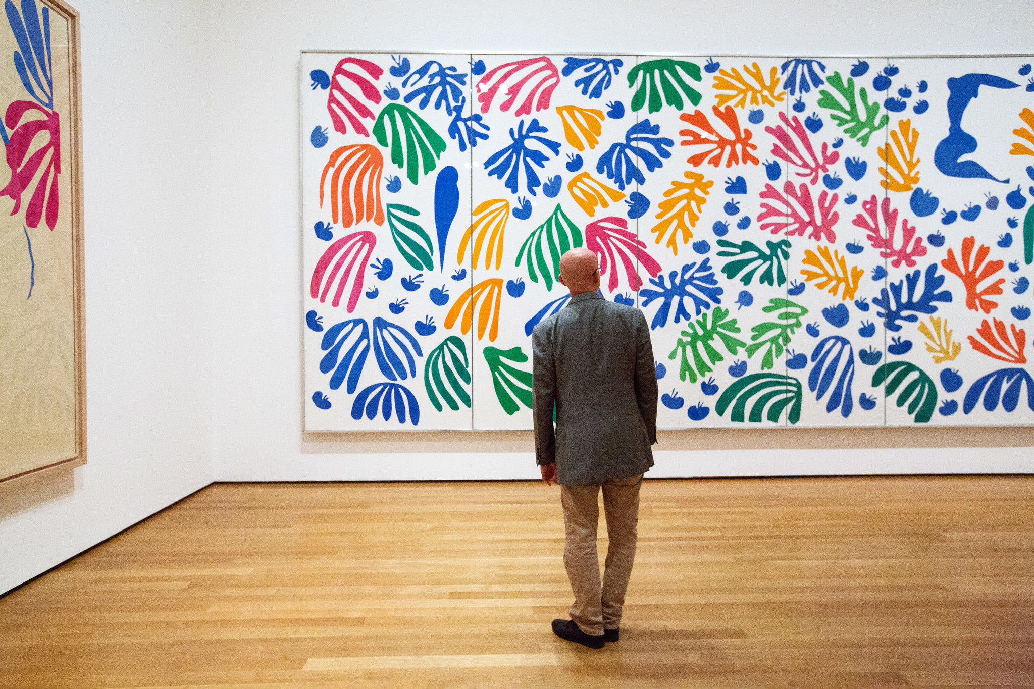
Henri Matisse
Later in his career, due to declining health, but wanting to still create, Matisse turned to paper cutouts. Some of the works are quite large as you see and hence the pieces are easier to handle and cut.
Jean Arp made a number of geometric collages such as the one below. I suspect the colors have faded and shifted.

He also made some similar works that he claimed to be done by chance, by dropping papers randomly perhaps, such as:

Arp had great facility making free form works such as the collage below from 1962 that he used as a model for a poster. He also made wonderful free form sculpture. To see it just enter his name in the blog search bar.

Is it a malformed kidney or a bird or? Is it white on top of blue on top of pale yellow or all the pieces cut and fitted to be flat? Does it make a difference to the look? In any case, I think it is difficult to make such free flowing curves that look organic and unplanned.
Cultural, Political. and Photographic Collage
Picasso and Braque
We now make an abrupt change. Picasso and Braque in the early 1900s began gluing a wider range of materials to a background, such as theater tickets, sheet music, newsprint, cord, wall paper, and textiles. Those works have a cubist character and subdued color.
Later, as photographs became widely available they were used for collage. That practice goes by the name Photomontage which is the cutting and mounting of photographs.
John Heartfield
A famous early practitioner was the German artist John Heartfield. He changed his German name to an English translation of the name in order to disassociate himself from the Germany that gave rise to Hitler. See his iconic work.

Hannah Hoch
On a lighter note, and promoting feminism in a sense, see a photomontage from 1930 by Hannah Hoch, part of a series inspired by works from an ethnographic museum. The color photography is truly impressive for the time.

Actually, this image is likely made using hand colored individual photos. Or, alternatively, one could make a montage of black and white photos then make one black and white photo of the montage then color the single resulting photo.
The practice of coloring photos was present in commerce and postcards from an early time. In fact, surprisingly attractive and subtle colored photos go all the way back to the later 1800s. They have a humanistic artful look different than the slick look of today. An abundance of them can be seen via a google image search.
By the way, Hannah Hoch's shoulders and head are larger compared to the body of the statue. Speculate on what purpose that serves. Notice the eye also. Many collages play on incongruities as we soon will see. I think her artwork is one we will remember.
Max Ernst
Max Ernst was an inventive German artist who succeeded escaping the Nazi regime in Germany, then fleeing from Nazi occupied France to the United States. See his work from 1933 called The Petrified City.

Ernst was a pioneer in creatively using a number of techniques. A well known and popular method you may know is frottage in which you lay paper over an object with texture or a design, like a quarter coin, then rub a pencil on top repeatedly until an image appears on the paper.
In the work shown Ernst used a related technique called grattage in which you take a paper that has been painted with a one or more coats of paint of one color followed on top with more coats of a different color. You lay that painted paper firmly on top of some textured or designed surface having a pattern you like. You then scrape or grate the paper to remove the higher layers thus revealing a version of the pattern from underneath. That is sometimes referred to as telegraphing the topography beneath. It is claimed that Ernst used grattage to make strips then positioned and mounted the strips. You can see that gives control of size, color, and orientation of the different strips to give a progressive effect from bottom to top of the city which looks much like a ruin.
I think it is clear enough that the whole effect by painting alone would be a great challenge. On the other hand, note the atmospheric quality of the (painted?) sky.
In any case, in this work Ernst has created an air of ancientness, melancholy, mystery, and wonder. Note that it is unusual to place a major object, like the moon in this case, in a central position. The large size seems peculiar but can be accepted. In fact, who is to say that is our moon on our planet?
Reference sources like Art UK say the work is at the Manchester, UK art gallery. But we have to take account that museums may not show works they consider fragile or subject to light damage.
Many collages juxtapose different images and can be described as interesting, odd, strange, incongruent, or attention grabbing. We will show some milder forms of that shortly. In contrast, the works of Hoch and Ernst that we just displayed have oddness but an esthetic quality as well.
Richard Hamilton A British artist Richard Hamilton is considered a pioneer in Pop Art. See his collage from 1956 -- before American pop art. The title is: Just What Is It That Makes Today’s Homes So Different, So Appealing?
Is he saying something about consumerism, advertising, sexuality, and what influences and shapes us? Besides the fleshy bodies, notice the prosaic consumer items here and there.
How is Hamilton's pop art different than that of Warhol and Lichtenstein?.jpg)
Staying British, David Hockney made perhaps scores of color photographs to form what he called joiners. The different constituent photos can have different lighting and exposure which gives an unusual charm.

Jisbar
Please look at a contemporary pop art collage by an artist whose nom de art is Jisbar. His actual name is Jean-Baptiste Launay. He has a series of similar works, each referred to as a Rock Madonna or Mona Lisa.
.jpg)
Jisbar images are seen on the internet being sold as posters -- a tribute to their popularity. Could you put your finger on what about the work makes it widely popular? For that matter what makes it a pop art work? Whose eye? Whose lips? Whose bow? What feeling do the hand written messages give? Is the work satirical, mocking, playful, happy, sad? Is it a graffiti work? How so?
Who do you think is apt to buy and display a Jisbar poster? You?
Mark Bradford
Say, don't forget we have seen works made from paper by Mark Bradford. Those could qualify as collage but on a very large scale. Just search for Bradford on the search bar.
Status and Permanence
Note that all these works have less commercial cachet than the large paintings that dominate the current art market. Besides, these works are made of paper that can deteriorate due to acid content. They can also curl or unglue. Still more, the inks and the photos are light sensitive and subject to fading or color shift. Hence, museums tend to not have them on display or do so infrequently or have them dimly lit.
Comments
Post a Comment
You are invited to comment if you wish.