Letter Art
We will look now at two kinds of art made with letters --- text art then large letter art. In them the appearance is primary-- that is, for its own sake -- and the message is absent or secondary.
We will look now at two kinds of art made with letters --- text art then large letter art. In them the appearance is primary-- that is, for its own sake -- and the message is absent or secondary.
For comparison, please recall that in word art, seen previously, it is just the reverse, the message is primary and the appearance is secondary.
Texts Used to make Patterns
Jose Vera Matos
The Peruvian artist Jose Vera Matos transcribes philosophical texts by hand. The texts discuss how colonial powers reacted with the native civilizations of the Americas. They explain how the colonizers did, and still do, appropriate, take over, and trade in pre-Columbian art. These objects are displayed as valuable art items largely in disregard for their original use and context.
Matos transcribes the texts as an act meaningful to him but not easily seen and read by the viewer who sees only the overall pattern. To get a sense of this right away, we exhibit one of his works that we will show again and explain later.


In this first one, do you see interlocking shapes and staircases and curls? I admit, you need some willingness and imagination. 
The Love sculpture has become so popular that Indiana himself made a similar sculpture called Hope. Others have made many knock offs. To learn about that, do a Google search for the insightful New York Times article: His Art, Their Ideas: Did Robert Indiana lose control of his work?
David Carson A different approach to freely use letters of different sizes and orientations is best known in the works by the designer David Carson. We show, as the slightest introduction, one of the simplest of Carson's works. He has a fertile imagination and can open your eyes to a world of design possibilities. 
Jose Vera Matos
The Peruvian artist Jose Vera Matos transcribes philosophical texts by hand. The texts discuss how colonial powers reacted with the native civilizations of the Americas. They explain how the colonizers did, and still do, appropriate, take over, and trade in pre-Columbian art. These objects are displayed as valuable art items largely in disregard for their original use and context.
Matos transcribes the texts as an act meaningful to him but not easily seen and read by the viewer who sees only the overall pattern. To get a sense of this right away, we exhibit one of his works that we will show again and explain later.

To examine this work by Matos it is helpful to look first at ancient influences within his culture.
Mesoamerican Patterns
The patterns of Matos's work have a Mesoamerican look if you know what to look for. To help or give evidence for that comparison, look first at the stone fret designs from buildings in the ancient Zapotec city of Mitla in the Mexican state of Oaxaca.

Notice at the top, the interlocking J shapes with saw tooth tails. In the middle band see wave or curled shapes with thick staircase tails. The lowest band is hard to describe --- something like a large 5 shape with a long streaming tail of lozenge shapes or parallelograms. All of these basic shapes repeat, interlock, or interact with each other, including filling in each others spaces.
I suspect that these patterns were originally invented as textile patterns. In fact you can look up Mesoamerican textile patterns.
Two Matos Transcriptions
Now, see two transcription drawings by Matos (long discursive titles omitted).
To make the works, Matos transcribes the texts using a fine stylograph pen applied to bamboo paper roughly 20 by 30 inches in size. He arranges the written texts, sometimes horizontally and sometimes vertically, into interlocking positive spaces. Those, in turn, form interesting negative spaces, that is, plain white background areas.


Irma Blank has another class of works that use asemic writing. Asemic writing examples vary greatly but give an appearance of writing that can seem like a strange but real language or be obviously just a rough approximation of writing. For more, see the Wikipedia article on Asemic writing. I think of this as being to writing what "speaking in tongues" is to true language speaking. 
Do you think she made a square separately and completely, then went on to the next square? Or did she proceed along a horizontal line then skip a space or two, then continue the line into the first line of the next square? Does it make a difference to the look? 
Another work shows streams of dots --- a bit like lines of text or even stacked barrels. 


Note the distinctive negative spaces. The print exists also in lower contrast versions. How does your taste run in that regard? 
In this second work, do you see staircase shapes along the left edge? And blocks and tails? Note the two colors this time.
Your Views
Which of the two works do you prefer? Why? Consider contrast, design, paleness or darkness of color. Which has more Mesoamerican characteristics? In what particular ways?
Do you think the works are too busy, that is, they have too much going on? In what way would you crop each of them? An effective way to visualize a possible cropping is to make two home made L shape framing pieces out of thin cardboard and move them around on the artwork. You might find a crop more appealing, more unified, or stronger.
Further Matos artworks can be seen together with an enlightening discussion in an interview on YouTube, namely:
José Vera Matos & Julieta González | Poetics of Relation Irma Blank
Irma Blank came from Germany, but spent most of her career in Italy. She abstracted text a step further by showing the appearance, kind of a schematic, of a printed page justified left or center, with usual indents, and paragraph breaks, as shown.
She also makes works in which her asemic writing flows along in rivulets.
Another work shows streams of dots --- a bit like lines of text or even stacked barrels.
Further, I saw a work of hers done in individual spindly cursive proper letters. That work appeared in an exhibition in the Summer of 2023 called World Framed. It was put on at the Kupfurstich Kabinett which comprises a collection of drawings, prints, and watercolors in Berlin. In some exhibitions, as in this one, photos are not permitted often because loaned artworks are on display. Further, I have not found an image of Blank's cursive work or something like it elsewhere. So I present a sketch of my own based on my recollection of Irma Blank's cursive drawing.
Are the letters readable? Are they ignorable as letters if desired? Would you call this an example of lyrical abstract art? What freedoms does the artist have? Does this work have any merit over the text works we have seen? Which of the works would you have in your home and where within your home?
Say, the works by Matos are particularly tedious and repetitious. What other human activities employ long dedication and repetitiveness?
Well, I can think of repeated prayer as in the rosary, chants, dancing, knitting, crocheting, rug making, music practice, marathon running, and Australian aboriginal dot painting.
So, in repetition, is there satisfaction, strength, consolation?
Large Letter Works
The pop artists Jasper Johns and Robert Indiana each made this type. Because of the closer affinity of this category to previous works, we have saved them until the end of the blog.
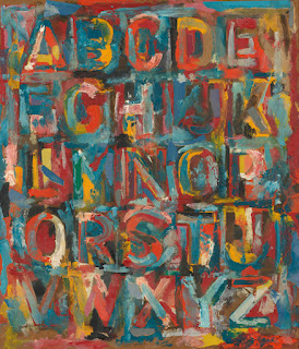
Jasper Johns
The American pop artist Jasper Johns made works in encaustic, a kind of hot wax, that allows a lot of texture and veiling --- one might even say camouflage. See his work called Alphabet.

Robert Indiana
In contrast, Robert Indiana (born Robert Clark in Indiana) made a very clear, readable and now iconic work, called Love. See a screen print version first.

Love can be found also as a sculpture. I found a very nice image of Indiana's Love sculpture in a park-like setting. I find that a better context than the many brash presentations in urban settings having no trees or people or depth.

David Carson

To understand and appreciate that, I highly recommend that you watch a YouTube video: Art Inspiration: David Carson Graphics & Collage. It is part of a series called Imperfect Paintings. There is a companion video in the series called: You don’t need to know graphic design to use it.
Comments
Post a Comment
You are invited to comment if you wish.