Please see another painting based on an underlying grid structure done by Robert Otto Epstein. There is so much color closely juxtaposed that you might prefer to look for a few seconds then look away, then come back.

The kind of staircase effect seen at the collar, is what Epstein calls biterization. The staircase is a low grade approximation to a slant line, provided you only have a coarse array of square cells to work with. In the picture, throughout the man’s body and head you see the coarse squares effect.
Early computer screens had few pixels and images of necessity looked like that. Even now with many pixels, if you magnify the image enough you will see the staircase effect. The name biterization comes from the computer term ‒ bit. A bit is the most basic data entity. It is represented numerically by a zero or a one. At each pixel position bits and bytes can encode color and intensity. Epstein's name biterization may be better known as pixilation.
Say, let's consider the strength and juxtaposition of the colors. All the background colors could be muted a little if desired. It is rare to see so many bright colors together. But we have to realize that the painting itself would not look as bright since it is seen by reflected light. Our screens are lit from behind, hence brighter. It is hard to know how to react to the man's colors, especially the skin tone. If the skin tone is peculiar, that may be all the better for parody.
How do you feel about the work? Does it make you a little woozy? On my screen the man's sweater is optically quivering. Suppose this were a collage and the man was applied on top of the background. Then it would be easy to change the background and try out the effect. What is your taste and judgement here? Can you name a few things that make the man look jaunty? What about the pants? As loud as they are, they look clam and regular compared to the rest. Does he remind you of anybody?
A Rule that Generates the Background
Epstein also has a process working on the background. The painting can be enjoyed without understanding the process, but for the curious, here is an explanation of a portion of it. Take the dark blue zig-zag line or stripe to the right of the man’s head as our starting line. To the right of that dark blue line, paint a mid blue zig-zag line touching the dark blue line and following its shape. Next, to the right of the mid blue line, paint the pink line following the shape of the mid blue line. Then fill in the remaining small rectangles with white and with green, finishing the process. Go back to the dark blue starting zig-zag line and paint a yellow line to its left, then red to the left of the yellow line.
For convenience, we spoke of lines throughout but you could think of them as stripes. Also, the starting blue line could have been drawn differently to start with. Then the pattern made from it would naturally look different.
That same process is used elsewhere on this painting and in other entirely zig-zag paintings by Epstein, which show off the process better but lack the jaunty man. They can be seen on his own website.
You can also experience a pleasant visit with Robert Epstein together with more of his paintings and a model wearing clothing inspired by his art. Go to the blog artfullyawear.com, then to the post of May 23, 2017. Moreover, you will find many other attractive and rewarding posts on that site.
A Textured Grid
Please look closely at the grid by the African American artist McArthur Binion. It is called DNA study and was shown in Chicago in 2014. The painting has pronounced texture, alternating vertical and horizontal strokes, groups of cells of similar color, and a diagonal transition line.
Binion starts with an underpainting, then over that he applies an oil stick which is a kind of large crayon made of wax and oil paint. With that he can produce bold drawing effects. His works are large, at 6 feet by 6 feet or more. Our cropped slant view photo shows the furrows and ridges created by the oil stick, whereas, a picture of the whole painting, not on a slant, would show more area but reduce the texture.

Let’s analyze what we see. Look at the area to the left of the slant line. The background there is light gray, mid gray, or orange. All the oil stick strokes on top of that background are either gray or a blue that harmonizes with the gray. Those gray or blue strokes unify the entire area to the lower left of the slant line.
Now look at the area to the right of the slant line. The background there looks off-white. The strokes on top of the background are cool mint green or warm olive green. Those two greens unify the entire area to the upper right of the slant line. Notice that the cells need no outlining or even change of color to stand out because the change of stroke direction marks off each cell.
Cropping
Our presentation of Binion’s painting is cropped. You must have noticed the magic of cropping. You can discover within a picture attractive sub pictures ‒ sometimes more than one. Frequently the crops look better than the whole picture.
In other fields as well, the part may be better than the whole. In music, there are operas where only the overture or an aria are cherished and performed. It occurs with songs also. Later in this book, related to an artwork, we look at two patriotic songs ‒ The Star Spangled Banner and America the Beautiful. Those songs have popular stanzas that are sung frequently but they have other authentic stanzas that most Americans never heard of. Those stanzas didn’t make the cut.
In literature, how about Shakespearean quotes you like even though you never experienced the whole play or don’t wish to. The bible has often quoted gems and other so-so passages. Maybe we are overly respectful of a complete work and even more so of a body of works.
Grid of Colored Essay Sheets
We met the word-artist Jenny Holzer in the overview chapter. Recall she made a message on a scrolling lighted sign that read ‒ protect me from what I want. Those kinds of one line proverbs became known as her truisms. In a later chapter on conceptual art we will analyze six of Holzer’s truisms and compare them to famous aphorisms.
After writing many truisms she began writing essays of a special kind. Because of their deliberate intent to agitate people she called them Inflammatory Essays. Each essay is composed of 100 words spread over 20 lines and has the character of a manifesto, or of incitement to take action. The Tate Modern Museum in London displayed the essays, printed on colored papers, in a grid form as shown.
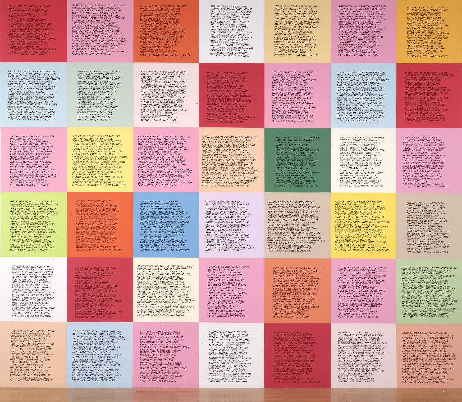
What is noteworthy about displaying them this way? From a distance, the printed lines become a decoration or a texture. Seen somewhat closer, they remind me of flyers or announcements. On a grander scale they seem like royal proclamations or Luther’s 95 theses nailed on the door of Wittenberg Cathedral, that is, they are some important printed material displayed very prominently in a public place.
The use of materials and presentation other than that of conventional paintings is very much in vogue in contemporary art.
Losing all that aura of the grid, you can read the individual full size essays on the Tate museum website. They seem the work of religious or political zealots, cynics, or revolutionaries. They are frighteningly raw and amoral ‒ but thought provoking. I could have included one here but it is the cumulative effect of reading a number of them that has an impact.
Comments
Post a Comment
You are invited to comment if you wish.