Process Makes the Art Object
Bernard Frize
The contemporary French artist Bernard Frize uses interesting processes that will serve as a sound introduction to Process Art. Let’s associate convenient descriptive names with his paintings. Please look at his painting called Insulaire from 2004 which looks somewhat like flowing chevrons. Compare that with another Frize painting, much more densely painted, which looks like a marble pattern or expanding colliding wave fronts.


Frize’s process
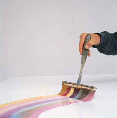
As to Frize’s process, look at a photo of him pulling, with hand and arm, a wide brush looking like a small push broom. The broom-brush is loaded with paint of different colors right next to each other thus leaving tracks of paint that slightly blend at the edge of each track. The brush can be swirled to produce interesting results. I think you can see those adjacent color tracks in the marble painting.
Picture a loaded broom-brush with colors in the sequence, green, light blue, red, yellow, dark blue, orange. See how that sequence of color tracks navigates around bulged or eddy regions in the marble painting. Frize’s paintings are on the order of 6 feet by 7 feet or larger so you see that he has room for the wide multi-loaded brush. Of course he can use a smaller brush for sharp turns or peaks as needed.
Remember, Frize has to reload the brush. Notice there are places where the brushing stops cleanly then restarts, adding a kind of faceted look. How is the clean stop and start managed? Ordinary brushing would be a bit smudged at the transition of stop and start.
We weren’t looking over Frize’s shoulder, but he could have used a small thin edged but wide enough spatula that he pulls the brush up onto to finish the stroke ‒ somewhat like a highway off-ramp. Then to start the next stroke, reverse the process by starting on the wide spatula, then brushing forward down onto the canvas to continue ‒ like an on-ramp. One could speculate that he uses such a start up method even on the edge of the canvas, otherwise the press and contact at the start of a stroke will look different than part of a continuing flowing stroke.
Do artists really sweat the details that much? I think so. Those details make the difference between polished elegance and sloppy bumbling. Or perhaps we could say rightly that the artist him or herself is a demanding taskmaster and won’t settle for less and will invent a method to get the desired quality result.
Don’t forget, we don’t see the unsatisfactory paintings that didn’t make the cut and were set aside to be reworked or thrown away. In Frize’s own words “It is easy to see the failures when painting. Then I just start again on another canvas. When they are finished, paintings are sieved through several times, considered in relation to others, compared, then kept or discarded.”
Look back again at the flowing chevron painting which has a different look. Each chevron has a dark edge then very smooth gradation towards white which is bounded by the dark edge of the next chevron. Within a band, there is only one color, strong at the edge, then fading off towards white.
We could speculate that Frize used a brush loaded with strong color on the edge and solvent next to it. Or easier, paint the lighter part diluted with solvent first, then paint the concentrated color edge on top. I mention using clear solvent because mixing a color with white gives a different ‒ more chalky ‒ look than the pure light color we see.
Other photos can be found of Frize with a few assistants, all brushing at once from different directions, each with a modest sized loaded brush moving on different yet coordinated trajectories – like a choreographed dance. I think that method creates wet paint tracks touching or crossing other wet tracks.
See two more of Frize’s paintings. The first one, called Isotopie from 2016, has broad tracks of thinned semi transparent paint. The stops and starts and overlaps of the brush strokes show clearly this time. And notice the interesting over and under pattern of the paint paths.

Some other Frize paintings of this type have more paint paths so that the viewer is dazzled and is challenged to distinguish the paths. The Isotopie painting strikes the right balance of complexity and readability.
Both the chevron painting and Isotopie have a light airy look compared to the heavy look of the marbled painting. Our last Frize painting, called Alva, looks like very heavy drapes. Frize has a number of variations with the over drapes drawn over to one side rather than parting in the middle. The paint looks thick but not opaque. That effect could be achieved by mixing concentrated paint with a thick clear medium.

What do you see as the proper usage of the airy versus heavy paintings? Are they good for different rooms in a house? Which kind, the light airy ones or the thick heavy ones, do you think fetch higher prices in galleries and auctions? What about size? Do bigger paintings get bigger prices? Some modern paintings are huge -- on the order of 6 by 10 feet or larger. Do you think buyers display them at home?
Summarizing Frize
Process art begins with the discovery or invention of a process, then skill in carrying out the process, knowing your tools and how your materials behave, followed lastly by an element of whim or chance in coming to the result. We lingered on Frize’s work due to the clear linkage between his process and result.
Here is a laconic quote from Bernard Frize, “The brush paints.” I know it's not much to go on, but could you expand and explain what he probably meant?
Comments
Post a Comment
You are invited to comment if you wish.