Introduction
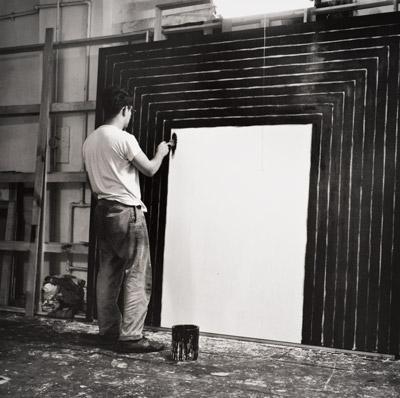
Black paintings were made by Frank Stella and by Ad Reinhardt. We show Stella as a young man making one. By the way, two from-the-tube black pigments are Ivory black and Mars black, but used straight they look plain. There are very deep purple paints available which when added to the straight black produce a more voluptuous black. There is another attractive “chromatic” black that can be mixed from a very dark blue and very dark brown, resulting in an intense lively black.
Black paintings were made by Frank Stella and by Ad Reinhardt. We show Stella as a young man making one. By the way, two from-the-tube black pigments are Ivory black and Mars black, but used straight they look plain. There are very deep purple paints available which when added to the straight black produce a more voluptuous black. There is another attractive “chromatic” black that can be mixed from a very dark blue and very dark brown, resulting in an intense lively black.
But in the photo of the young Stella, he is succeeding admirably with black paint out of a can and freehand ‒ amazing.
Digression ‒ Black Used For Clothing
Isn’t it strange that black is the garb of the religious pietist-ultra orthodox of any faith, but on the other hand black is used for women’s evening gowns and men’s tuxedos? In the first case it is austere and in the second, luxurious, glamorous, high-status, sexy. Black has an abstracting quality so we become more aware of the outline of the black shape. There is also the matter of contrast, the black gown against the woman’s skin, the black tuxedo against the man’s white shirt and bow tie, hence the description of the outfit as “stunning”.
That use of contrast distinguishes high society black from austere pious black. Can you imagine a pious man wearing a red bow tie – it would ruin his desired austere effect.
Hatching
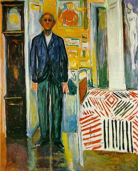

We discussed Jasper Johns previously and now we have a work of his with a background story. See the Edvard Munch self portrait named – Between the Clock and the Bed. Notice the design on the bedspread. I don’t know if the story is authentic but it is claimed that the bedspread was the inspiration for a series of cross hatch pictures by Jasper Johns. Please look at his screen print crosshatch design. There is quite a bit of room for judgment in fitting the crosshatch patches together. Johns has varied the angles, lengths, colors, and background to great effect.
Predict how the picture would look without the use of white here and there between the colored strokes. Suppose there was solid white between all the strokes, would it be better or worse? Why do you think so?
Comments
Post a Comment
You are invited to comment if you wish.