Minimalism: McCracken and Truitt
We ended the previous blog post with this reference.

Judd is known for his quotes, for instance, “A shape, a color, a surface is something in itself. It shouldn’t be concealed as part of a fairly different whole.”
In line with Judd’s quote, look at John McCracken’s one plank leaning against a wall. That is getting really simple. What role does the color of the floor and wall, width, thickness and color of board, and shadows play?
Here is McCracken’s view from his artist’s statement of 1999: “The plank form I’ve made symbolically connects two worlds. It touches the floor – the world of sculpture; the physical world we walk around in – and it touches the wall – the world of painting; the visionary world we look into”.
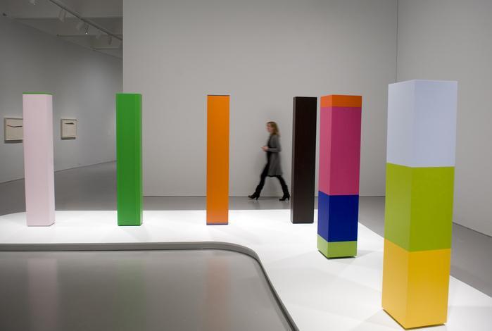
The American artist Anne Truitt makes free standing columns, some with more than one color on a column. Please look at her ensemble of six columns. Let’s compare Truitt’s different columns. For a single column, which gives a better effect, three equal color components on the column in front, or three unequal color components on the middle distance column, or just monochrome on the four back columns? What is the visual power of the group and the raised white L-shaped cloud they are on? I feel they are a family of columns with different personalities playing off one another. Color sings out better in proximity to other colors.
This is a wonderful work as regards the columns, their placement, the white pillow, the L shape, the photographer's chosen viewpoint, the person walking by, and even the color tone of the walls. Remember Richard Wagner, the champion of gesamtkunstwerk. I think if he were alive to see this Truitt ensemble he would call it a complete minimalist artwork.