Minimalist Geometric Abstraction
Please look at a 1977 exhibition catalog cover from the Nationalgalerie in Berlin, showing a work by the French artist Francois Morellet. The text on the sides detracts from the image but it indicates the painting’s status to be chosen for the cover. Is it clear which color stripes appear nearer? The nearer stripes overlap the ones behind, or we could say alternatively that the stripes that are behind disappear then reappear.
The arrangement is similar to a K-shape. That forms a congested knot of intersections on the left side. Does that knot add drama or interest? Think of some other possible arrangements of the stripes. How about L-shaped or H-shaped? The H-shape would be balanced but static and dull. Notice that acute angles of intersection are more interesting than right angles. What about the number of stripes and their width? Would the piece be more effective with more or fewer stripes that are wider or narrower? What about having four stripes of four different widths? How would that affect unity and balance? How do you feel about the colors chosen? All those choices matter to the end result.

The catalog cover looks like a copy of a screen print. Do you notice an airy lightness about the work? That glowing look can also be obtained with watercolor, but the edges would not look as sharp as we see here. Light passes through transparent watercolor and bounces off the white paper then back through the paint pigment before reaching your eye. You don’t get that glowing effect with opaque paints but some screen print inks have that bright look. On the other hand opaque paints can be bold and one color can cover another.
Morellet's artwork shows taste and judgment in arranging the stripes. This particular piece is simple enough that you could make a copy. You could lightly draw boundary lines in pencil, then carefully paint in watercolor, being careful at the intersections. The color that is to appear behind the other color has to stop at the intersection, while the color that is to appear on top should be painted through the intersection. Let each painted area thoroughly dry before painting an adjoining area because otherwise two moist areas next to each other may bleed into one another. Don’t paint one over the other at the intersections, unless you use opaque paint.
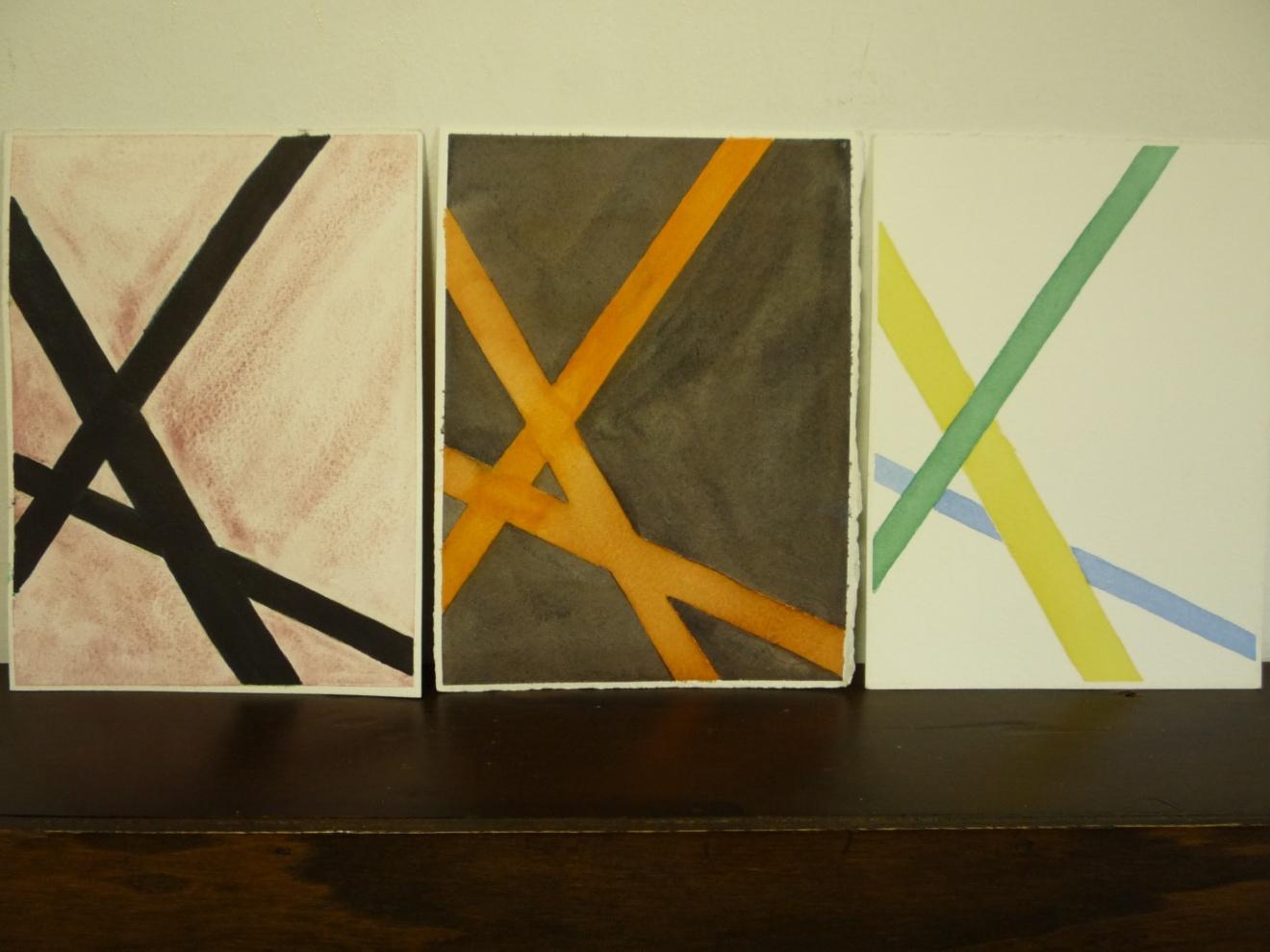
You could do the same with colored pencil which doesn’t need special paper like watercolor does. I made modified copies using watercolor and I reduced the number of stripes from four to three. Please see my three variations on Morellet’s design.
An even easier approach is to cut strips of colored paper, then lay them on the background paper. That way, you can easily shift the strips around – closer, further, how angled, how many, color of background, and so on.
When you are pleased, glue the strips down. The paper may not lay nicely if you use liquid glue. Fortunately, there are inexpensive glue sticks widely available. You just rub the stick on the back of a strip and glue it down.