Art in Groups
We saw the Leon Polk Smith corner ensemble and the pair of Rothko paintings. Now let’s begin a wider inquiry.
Where do we see art in groups? Mostly in museums and galleries. Rarely were the works made to be shown together, nevermind made to be harmonious together. Chronological grouping is of slight help and figurative groups especially portraits don’t make great ensembles. Groups arranged by movement or material or even by the same artist can look like second cousins rather than siblings.
Before we look specifically at abstract art ensembles, for orientation and comparison, let’s note other ensembles. Architecture has some. On the Washington DC mall the neoclassical buildings go well together as does the general traditional architecture in London and Paris. The decorative arts do well at putting together related interiors ‒ carpet, wall covering, bedspreads, upholstery, furniture, drapes, and curtains. Tableware is the ultimate of coordination as seen in sets of dishes and utensils ‒ so much so that a mismatched set is found unacceptable.
How strange ‒ the standard in tableware is exceptionally uniform compared to everything else, except perhaps car interiors which are also highly coordinated.
Nature does ensembles very well. Think of a grove of trees, a pumpkin patch, a flower arrangement, or a swan gliding on the water with a following brood of swanlets.
Art Ensembles
Before we group ensembles according to type, note that some fine examples occur elsewhere in the book, related to other themes. Our list for wider reference: standing columns by Anne Truitt, ensembles in the US embassy in Paris, Leon Polk Smith works in a corner, a group of four works by Blinky Palermo, two corner chalk drawings by Lewitt, and aborigine columns in Utrecht.
Now to analyse ensembles, we distinguish three kinds and illustrate them with examples afterwards.
Group One: A Portrayal. A single painting can have an ensemble of elements in it, as for instance a still life, especially a semi abstract one, as for instance by Giorgio Morandi. Logically this is not an ensemble, but a picture of an ensemble.
Group Two: A Set. A single work comprises a number of separate component pieces seen and comprehended together as a whole, as a set, such as those by Eduardo Terrazas and Judy Chicago to be seen soon.
Group Three: A Harmonious Group. A group of an artist’s separate works that are harmonious with each other so that they are displayed as an ensemble. Sometimes they are supplemented with artist designed furnishings like seating, as you recall was done by Mary Heilmann in the grid chapter. Sometimes the harmonious works are by kindred spirits.
Group One. Portrayal
Giorgio Morandi
Please see the still life from the 1950s by Giorgio Morandi. It is one of his more colorful works, most of which are decidedly subdued. Of some interest, the Italian name of what we call still life is Natura Morta ‒ nature deceased. Morandi spent his life in Bologna where there is now a museum devoted to his works. He specialized in still life, mostly pale, very calm, pure, and spiritual. His arrangements of the ceramics and bottles are rather plain ‒ no flowers, and nothing dramatic with the shadows.
His reputation resides in his long steadfast career and the feeling of serenity or timelessness in his work. His paintings regularly appear in retrospective shows at major museums as well as in books about him.

Group Two. A Set.
Eduardo Terrazas
The ensemble of striped triangles shown by the Mexican artist Eduardo Terrazas not only look like siblings they look like clones except for shape and orientation. Please go along with our exploratory questions. Is the stripe color sequence the same in each one? Are all the stripes the same width? Is there a most dominant triangle? two triangles? How many right triangles are there? Are all the stripes parallel to a base? Did it have to be that way? The stripes are all either horizontal or vertical. Suppose they were in random directions. How would that affect stability? More generally, how much orderliness do we want in an artwork? Look at the negative space. Is it consistent? interesting?

Judy Chicago
The American feminist artist, who named herself Judy Chicago, actual name Judith Cohen, created a grand ensemble, from 1979, called the Dinner Party. It is categorized as an installation and takes up an entire large darkened room in the Brooklyn museum in New York City. The room darkening isn’t because of light sensitivity but to create a sense of communing spirits of the ages. The work is composed of a custom made triangular table so large as to accommodate 39 elaborate place settings named for historically famous women such as Sappho, Ancient Greek poet, Sacajawea, Indian guide, and Susan B. Anthony, suffragette. See the photo of Sappho’s place setting, with the setting for Judith, ancient Hebrew heroine, just to the left.
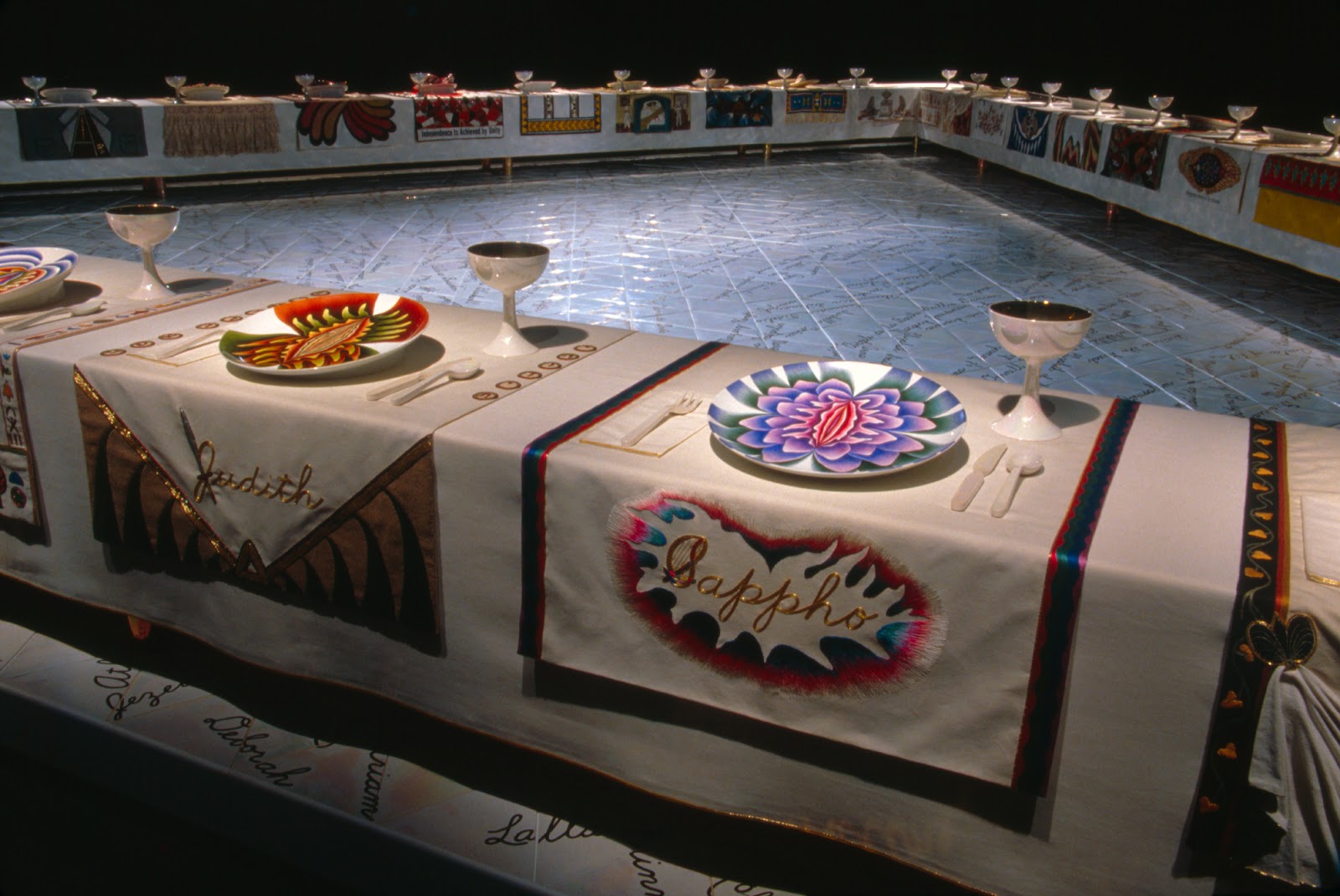
The work created controversy because the ceramic dinner plates depict stylized vulvas, some painted on and others in such high relief to seem to be jumping off the plate. The three table sides are called wings, for the three periods, roughly from prehistory to 0 AD, 0 to 1600, and 1600 to the present. To paraphrase Judy Chicago ‒ the work has as its ideal, to end the cycle of omission of women from the historical record.
There is no representation of, or actual, food, appetizers, wine bottles, fruit, desert, musical instruments, candelabras, flowers, or chandeliers. There are no chairs to sit on ‒ nevermind, no rolling bar. The center area within the triangle of dining tables is completely bare. That, plus the subdued light gives a sense of a memorial or mortuary.
Knowing that women enjoy talking and interacting, the whole could have been made as a joyous rather than sombre affair. What do you think ‒ better as is, or a joyous affair, or some other way? Actually, you could have a rotating temporary selection of accoutrements made or chosen by other artists or by the public. It would give the work new life or a life it never had.
Group Three. A Harmonious Group
Mary Heilmann
See four artworks and a chair by Mary Heilmann. Her work has a characteristic look, sometimes referred to as light hearted, unpretentious, and maybe a bit quirky. She also designs chairs on rollers for her exhibitions. Note the patterned chair back. Viewers can and do sit and roll around the area seeking different viewpoints.
The large painting on the left is composed of three panels, known from earlier times as a tryptic. What is the idea driving the sequence of colors in the tryptic? The yellow border color of the first becomes the center color of the second. The black border color of the second becomes the center color of the third. How is the third panel related to the first panel? Does the yellow look brighter in the first or the second panel? Why?
Look at the third painting from the left. It is composed of two stepped blue areas in the corners and three small rectangles in echelon form crossing the center. Explain the importance of the black central area. What does it do to the colors?
The work on the far right could be made on two rectangular canvases next to each other, but I can’t see a seam, so it is likely that it is what is called a shaped canvas. Such canvasses are custom made and I know Heilmann uses them for other works. A shaped canvas is a way to escape from the rectangle and obtain shape variety. The black part looks a bit like a circular sector but not quite. Notice that little red shape on top and the muted green on bottom right. The shape of the black and those small colored areas are little surprises. Do you think the chair goes with the ensemble?

Henriette van’t Hoog
Please look at the four artwork ensemble clinging to a wall. It was made by the Dutch artist Henriette van’t Hoog. I say the works are clinging because they are not hung in a normal way. They stand out in various ways such as the one in the corner on the far left that is like a pop-up card. The vertical line of the wall corner is hard to see but the artwork indeed spans across that corner. There is a white tab attached flat to the left wall, then a turquoise part comes nearly perpendicular to that wall, then folds and becomes yellow as it approaches the right wall.

A hallmark of these pieces is that they allow air space between the artwork and the wall. The black cube on top and the rectangular box on the right are probably three dimensional objects although van’t Hoog also sometimes plays with three dimensional appearance. The pieces stand off the wall, sometimes quite a bit, but if you look at them head on you can’t see that.
The hidden back side of the boxes are painted a reflective color or even covered with a colored mirror-like material such as mylar. You can see a faint yellow glow behind the black box and a more pronounced orange glow behind the rectangular box. The rectangular box being tilted has its back sides more able to capture and reflect light from the room. Notice the unusual effect of simultaneous glow and cast shadow mixed together.
For the deep dull pink object at the bottom, in the photo it is hard to tell if it is completely flat or standing out from the wall and being hollow with a white interior. If you look closely there seem to be shadows indicating it is hollow and stands out.
It is difficult to analyse artworks authoritatively from a picture alone so we had to rely on basic principles and some reasonable speculation.
Do you think the four objects have a unity of design that makes them a good ensemble? We have seen a few ensembles in a corner, which means they are on adjacent walls and can see each other? If they stand out from the wall they see each other even better. Why should we care if the works can see each other? Do we identify with them?
The van’t Hoog pieces are of modest size, maybe in the order of a foot wide. Do you think the reflecting back side idea would work for larger pieces such as seen at big name American galleries, say six feet or more wide?
If you like her work, see the comprehensive and well organized website of Henriette van’t Hoog.
Harmonious Works by Different Artists
We viewed multiple artworks able to see each other across adjacent walls. With just two artworks the relation is more intimate and sensitive to the need for harmony.
Binion and Mann
Please look at the works of two artists, shown together in 2013, whose other works might not be complementary in the way these are. The left piece, an isosceles triangle with vertex downwards, is by the African American artist McArthur Binion. Recall a deeply textured grid painting by him in the Grid chapter.

The paint on the triangle looks smooth. It would be rather plain except for one thing ‒ the slightly off center separation line between the colors. That is simple, unexpected, and effective. Is it good that the triangle is facing down? That way there are two unequal width shadows cast downward, which provide visual interest.
The Curtis Mann work on the right is harder to decipher. It is said to be a chromogenic print. That simply means a print made by a photographic chemical process, like an ordinary photo, rather than an inkjet print such as a giclee print. Mann is known to work with large photographs and alter them by numerous methods including bleaching and coloring.
What did Mann take a picture of? The image as seen in the photo could just as well have been made by dabbing paint with brush on paper. Please don’t be put off by our groping for an understanding of the technique. If you are not in on the process, figuring it out is somewhat like reverse engineering. And if you found a process that accounted for everything about the work that you liked, but it wasn’t what the artist actually used, would that be bad?
As a hypothesis, if Curtis Mann started with a hand painted all-over pattern on paper and photographed it, what advantage would that be? He could enlarge, shrink, or crop the image and manipulate it using a photo editor and make multiples of different colors and tones. His usual practice is to work with photos, so that would explain a lot.
Mann’s photo appears to have glass in front. It is rare to see a work on paper or a photograph without glass in front and that procedure is showing up more for oil paintings. It is a decided letdown to see the Mona Lisa under glass.
How do the two works go together? Smooth red and black on the left and finely textured gray on the right. Red goes well with black and gray. If you introduced another color where would you put it? Do the artworks have the same mood? Note the black of the triangle is on the side closest to the gray of Mann’s work. Was that serendipity or arranged?
Mexican Harmony
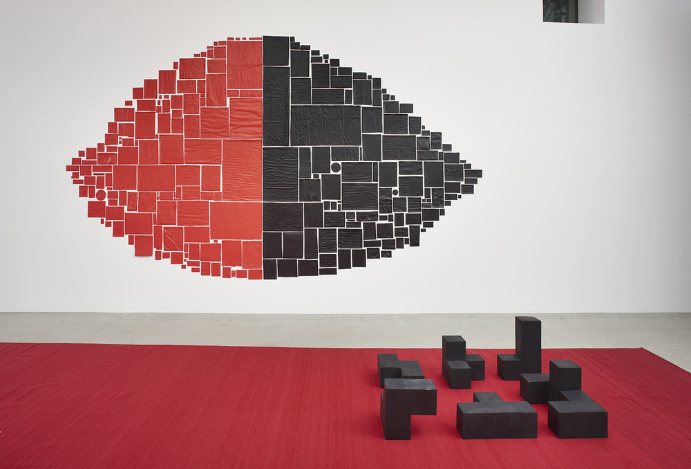
Please look at the ensemble of red and black lemon and black blocks by Mexican artists. The lemon is by Abraham Cruzvillegas and the blocks are by the sculptor Damian Ortega. The works are not across a corner but they can still easily see each other. And although they are by different artists they go well ‒ having a large amount of black in common and notice the blacks are nearest to each other.
Cruzvillegas used found materials ‒ at least fifteen kinds ‒ from everyday life such as postcards, envelopes, photographs, tickets, flyers, and so on. He painted them with acrylic paint. You can see that the pieces are of common paper by the tell-tale wrinkles and bulges.
Ortega’s black blocks appear to be composed of four cubes each. It is hard to tell, but they might be the set of all configurations of four cubes each adjoined in various ways, except for four cubes in a row, which is not there and would be less interesting. Was the red carpet a good choice? The carpet is a deeper but related red to the red in the lemon.
Notice the many different sized rectangular items in the lemon body as well as on its outline. Part of the charm is that wonderful arrangement in the body and outline. The lemon outline uses bigger and smaller pieces yet the outline seems all of a piece stylistically.
Art seeks both interesting differences as well as unity. That combination is found here. Perhaps because of working under the restriction of using found items the figure has more character and meaning than otherwise.
Comments
Post a Comment
You are invited to comment if you wish.