Carmen Herrera
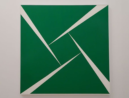
Please look at the painting Green and White from 1956 by the Cuban American artist Carmen Herrera. The work is a large acrylic painting on canvas, but you could make it as a collage of flat green pieces mounted onto a light background.
Take two identical rectangles, color them green, or start with green paper, or any other color you have or want, then cut the rectangles along the diagonal, thus making four right triangles. Cut out a small square. The length of the side of the square should be equal to the difference between the larger and smaller sides of the right triangles. You can choose any background color or material. You will simply lay the pieces on the background.
But --- what was just described makes four right triangles and a square that fit together perfectly with no gaps. If you examine any green triangle closely you notice the largest angle is a bit less than 90 degrees, perhaps 87 or 88 degrees. So, you have to slice a wedge off the base of each triangle, then you will have the correct triangles and produce the stiletto shaped spaces. If you are satisfied, glue the pieces to the background.
What is the drama or excitement of this piece? It seems to be the sharp, stiletto shaped light triangles ‒ the negative space.
Carmen Herrera had a retrospective exhibit at the Whitney Museum in New York in 2016 at age 101.
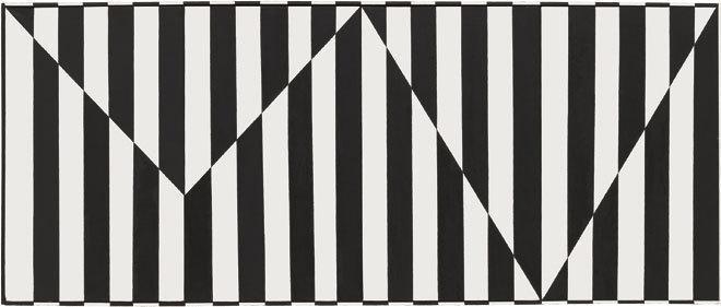
See Herrera’s second work in black and white stripes. It is a modest version of Op-Art. Both halves have black and white vertical stripes so how can we distinguish the upper and lower regions? You must have noticed, of course, that the stripes are out of registration. An upper black stripe meets a lower white stripe. Do you see a kind of shimmering or glow at the boundary line between the regions? That effect is related to simultaneous contrast ‒ the effect when a color is next to its complementary or opposite color, like blue and orange. In this case black is near its opposite white. The impressionists and Van Gogh often used simultaneous contrast. Notice, the end of each white bar has a black cap. Why is that?
Recall we previously discussed outlining. Its purpose was to distinguish edges so they wouldn’t just disappear into the adjacent area. That is exactly what would happen to the white bars. They would become part of the white background and the black bars would look like they were floating in space.
Here is a silly question. Why do the black bars not need a white cap? You could cleverly answer ‒ they have a white cap. Can you start to see them?
Leon Polk Smith
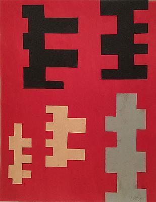
During Leon Polk Smith’s career he produced varied works of his own characteristic style. We will give him thorough coverage. Let’s start by looking at his collage from 1945 on a dull red background. Smith grew up in Oklahoma around Native American Indians and some of his early art has Indian characteristics of design and color. Look also at his meander drawing in black on white. There is a rich history of meander patterns like the familiar Greek key border design.
Tondos
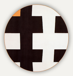
Smith was influenced by Mondrian as seen in the first round painting below. The second one below, black with white crosses, has moved away from Mondrian. These round works are also referred to as tondos.
In the second tondo below, notice the black and white duality. Which color is the positive space – the foreground and which color is the negative space – the background? Are they interchangeable? Notice the small amount of orange in the upper left corner and a very thin border of orange all around. The way it is shown in our photo it looks like a circle within a square, but the work itself is actually circular and has enough thickness to cast shadows on the wall.
Folding Screens
Please see below three examples of Smith’s small folding screens. Consider them made of stiff paper or light cardboard. The first started as a white parallelogram on a tan background. The second screen started as a red parallelogram on a white background. Then six vertical panels are formed by making five vertical cuts.
After that, tape is put on the back to hold the adjacent panels together but allow them to fold.
The multi colored screen again has rectangular panels but with different colors on either side of the diagonal of the rectangle. For example, the nearest rectangle with yellow and red.
These small screens are referred to as maquettes, that is, small scale models of larger screens that could be made. Notice the act of folding makes the basic shape more interesting as well as casting nice shadows on the screen. Much visual interest is had from these screens and they are easy to make.
Folding screens go back to first century B.C. China. They were used to block drafts or create privacy. An image search on the internet using keywords ‒ folding screens ‒ shows many styles, both Eastern and Western.


Comments
Post a Comment
You are invited to comment if you wish.