Rising up to a higher viewpoint, the land can be represented by maps. GPS relies on data that for human understanding is presented in a visual map form. Please look at how Stano Filko used a map as a patterned background in his 1967 painting Red and Blue Rockets, which are seen in the foreground. There are clear echoes of the Cold War in this work.

Filko also used a plain colored silhouette of a curvaceous woman with a map as background and another the reverse of that ‒ small maps and flags inside the woman’s silhouette and a plain colored background. So, a map can serve as a patterned foreground or patterned background.
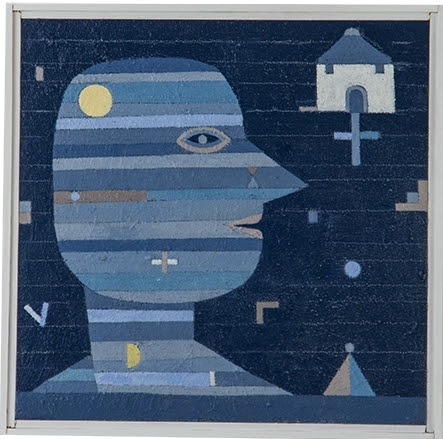
Sorry to disappoint you about the woman, but I do have a better illustration of a patterned foreground area. See below.
Map Related
Now, in relation to pattern usage, please view an oil painting with an internal pattern. It is from 2016, made by Guy Benson and is called ‒ Profile With House. Besides the patterned head and body, note the little floating objects in front of, around, and behind the man.
Back to maps, urban maps have streets indicated, but the American painter Gene Davis actually covered a street in painted stripes as seen in our picture.

Doesn’t that look like the Supreme Court building in the background? Davis was a member of the Washington School, a group of color enthusiast artists in DC.
Personal Social Maps
The handling of maps can be more abstract, more personal, and airy. What do I mean by airy? The American artist Nikki Rosato cuts away the map areas that are not roads. That makes a kind of skeleton of a map ‒ just the roads. Thus it has open spaces. Please see our photo showing roads serving as connections between a man and a woman.

South America
Please look now at a work from 1972 called America is Back Together, by Juan Downey. He is a South American artist and his map is appropriately the whole of South America. The caption tells you the media he used. The depth of color he achieved with colored pencil is quite remarkable. You can see the refreshing charm of a fine drawing after viewing so many paintings. Look at the patterns in the water area as if we were examining a nautical survey map of topography and water depth.
What about those vertical and horizontal white lines? It appears the work was made on separate mat boards which were then laid next to each other to make the complete picture. Bringing the boards together corresponds to the title. The naturalistic, the symbolic, and the abstract have been combined very well.

From time to time a piece of fine art will be adapted for use in the music publishing business. In the old days it might be for an album cover, but it still exists in some form perhaps as a CD cover. The music related adaptation has a new slant, quite literally. We seem to be looking at the map not perpendicularly, but from a lower vantage point and the bluish colors, noticeable in the water, have been shifted toward a warmer tan. In fact the entire work has a warmer tone.
Why do you think those who made the cover decided on the slant and color changes? Was it a good choice? Explain.

Comments
Post a Comment
You are invited to comment if you wish.