Tensegrity
Please look at the object, called four strut tensegrity, made of metal rods and cables. It looks impossible at first. In building upward, we expect one solid object to be placed on another solid object. This tensegrity construction is composed of stout rods and cables. To start to understand it, think of how you could balance a rod upright on a cable if you could just prevent the top of the rod from falling to the side.
With that in mind, look at the longest and tallest rod. It is a bit hard to see, but notice it is slung on three cables at the bottom, one clearly from the left, one harder to see from the thinnest rod facing toward us, and one downward to the right. At the top of that same longest rod, it is prevented from falling to the side by three cables. An easier attachment to see is at the top of the leftmost rod where three cables are attached to it from below to keep it in position.
That is the general idea ‒ cables to support the bottom of the rod and cables to keep the top of the rod in position. The name tensegrity, coined by Buckminster Fuller, is a shortened form of tensional integrity. The sculpture we have been discussing was designed by Kenneth Snelson, a pioneer in these structures.

These tensegrity structures can be quite strong as you can see in the photo of Snelson sitting on one of his creations.

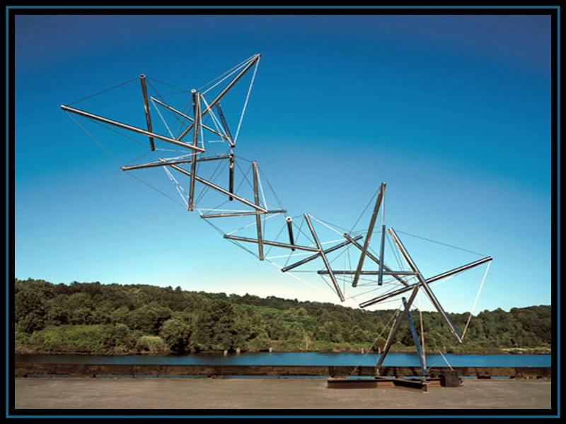
Just for fun, look at one of Snelson’s more exotic constructions which extends greatly off center. Notice also that this flattering photo shows a wonderful
gradation of sky color from deep blue higher up to lighter near the horizon.
Inflated Objects
We saw in the overview chapter, the outdoor inflated drug capsules at the Museo Jumex in Mexico City. Other floating objects were created by Andy Warhol in an exhibit called Silver Clouds. The exhibit consisted of a roomful of reflective pillow shaped mylar balloons together with a modest fan that caused the balloon-pillows to gently circulate within the room in unplanned ways. People, especially children, enjoyed interacting with the flying pillows.
Rather than free moving, a large inflated sculpture group can be fixed in place. The work shown below, called Sunbrella Connexions, is by French artist Charles Petillon. A more descriptive name could be crowded spheres. Notice, some of them seem to be kissing or at least adhering. The objects are spheres which are geometrical but the way they are presented is lyrical.

Computer Created Fabrications
The Petillon sphere material looks to be quite flexible. In contrast, please look at the construction by another French artist Marc Fornes. He is using some computer generated material called structural skin. It appears to be shapeable and not gushy. The lighting and the placement of the woman helps to make the enveloping construction look like a magical place.
For historical reference and comparison, the Fornes construction seems to have much of the character of Antoni Gaudi’s masonry architectural constructions from the early 1900s, especially the interior of Casa Batllo, which you can look into.

The construction is impressive but how does it come about? Marc Fornes is part of a project that goes by the name The Very Many. The entry page of the website theverymany.com, announces their work. “We compute design, advance digital fabrication, and craft spatial experiences.” The website shows real processes and finished works that are astounding.
Interventions
A category of artworks called interventions are placed into an environment with permission or not. The public projects we saw previously ‒ by Christo, Fritsch, and Smithson ‒ were done with permission.
Other interventions are without permission. That group includes graffiti, as by Banksy, smuggling artworks into a gallery, also by Banksy, hitting a Duchamp urinal with a hammer, placing mock landmines. More commendable, but still not done with approval, are the outdoor bronze statues called Charging Bull, stock market symbol, and later Fearless Girl, confronting the bull, both in New York City.
Please look at the temporary intervention called Pointed done in 2017 by the British artist Steve Messam. It is built into and onto a ruined roofless laundry house from the 1700s at Borders Sculpture Park at Mellerstain House in Southern Scotland.
As part of an approved project Messam made three kinds of inflatables, all of them white, to compensate in some fashion for the fact that centuries ago the mansion had to use local stone for statues because money ran out for the intended white marble statues.
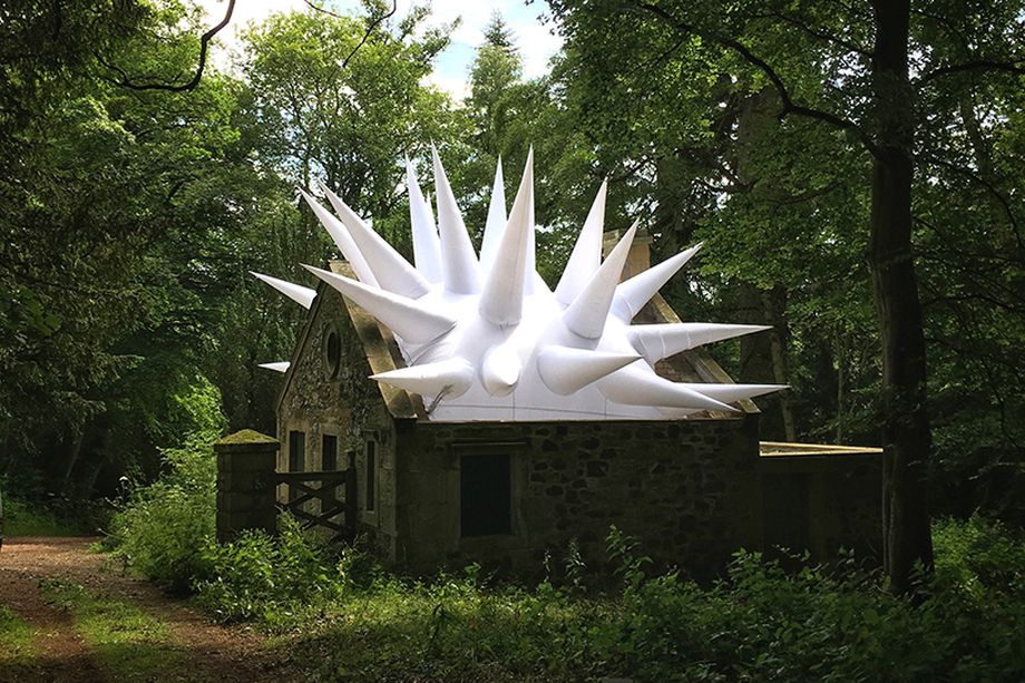
Was white and spikes a good choice? Notice the house is in shadow by contre jour lighting and by being in the woods. The strong highlight at the top of the extension wall on the right indicates light from above or behind. That contrast combination makes the spikes stand out exceptionally well. Notice that although the spikes themselves are white, under the light and shadow, parts look slightly blue or purple.
The house seems visually tied to the land by the standing pillar and short fence on the left and the extension on the right. If you can picture the house without those extensions you may see that it would jut from the land rather than be tied to it.
An experienced artist and author, I know of, advises when making landscape paintings, if such tie-ins to the land are not present, then take the liberty of putting them in anyway. Why be bound by exactly what you see? Similarly he advises, if something is there you don’t like, omit it.
There are other noteworthy things to observe although a bit difficult in our photo. The house walls are made of stone from the fields and are nicely done. But at the wall corners and around the windows and doors there are long dressed stones. That is a common practice to allow for close fitting doors and windows. Notice the circular window ‒ in a laundry house.
The top of the facade forms a cornice a bit higher than the roof. The roof isn’t there but you can see where it was. That feature of facade higher than roof line is associated with Dutch architecture but found in Scotland also. Does it make a nicer appearance when the facade hides the roof edge? Why don’t we do that?
The spiky white top is actually very regular ‒ all the spikes are identical and almost equally spaced. I think that regularity of the modern part is what makes this intervention work well aesthetically. It is a combination of a classic old part and a geometrically elegant regular modern part.
In admiring this combination, I think we are in good company because the much admired glass pyramid entrance to the Louvre museum by I. M. Pei uses that very same idea. The classic elegance of the old Louvre buildings go well with the elegant geometric regularity of the glass pyramid.
Comments
Post a Comment
You are invited to comment if you wish.