Our subject of interest turns to abstract art on flyers, posters, announcements, invitations, and book covers. These are rewarding and pertinent since they bring people together, but quality abstract designs are not common.
Please look at the invitation to a series of seasonal events at the National Gallery of art in Washington DC. In late Spring and early Fall the gallery is open after hours on a series of Thursday nights and it features live music, dance performances, talks by gallery educators, and hands-on art making. The invitation to the event series can exist in multiple forms ‒ hand-out flyers and displayed posters.

Writers like to make a play on words, so the title: Evenings At The Edge, has multiple meanings. One edge could be the vanguard edge of modern art. For another edge, you need to know about the shape of the new wing of the National Gallery. The wing was designed by the architect I.M. Pei, and has a prominent sharp vertical edge ‒ much sharper than a common ninety degree corner. This is a highly unusual and signature feature of the building.
The invitation seems to make reference, on the right side, to that physical edge. The wonderful thing is the image looks realistic and abstract at the same time, because the building itself is abstract. Further, the very act of looking upwards lends abstraction as commonly seen in dramatic skyscraper photos.
Notice the red of the sky is more orangey red – warm, on the left, and purplish red – cool on the right. And the lower left building face is more orangey and a little darker, so it represents shadow, compared to the building faces on the far left and right portrayed in full light. What do you see as the effect of all that? Light play? Excitement? Sophistication? Even the typeface matters ‒ all caps and sans serif. It looks modern, geometric, and clean. But the typeface at lower right is different. Why?
Use of the all caps typeface goes back to its origin at the Bauhaus art school in Germany in the 1920s and 1930s as we shall see later.
We have already seen a book cover ‒ one about a Morellet exhibit in the overview chapter and we will see another about Sarah Lucas and feminism in the conceptual chapter. Both of those books and covers are about artists.
See now artful covers of books not about art. The first is a 2018 novel by Rhiannon Navin called Only Child. It is about a six year old boy who survives a mass shooting in his school in which his older brother dies. Surprisingly, in time, he comes to an understanding and helps to hold his family together. The parents had previous difficulties that the school shooting intensified. The cover looks like torn scraps of colored paper reminiscent of child school art but perhaps of lives torn apart. The cover art is by Jenny Carrow.

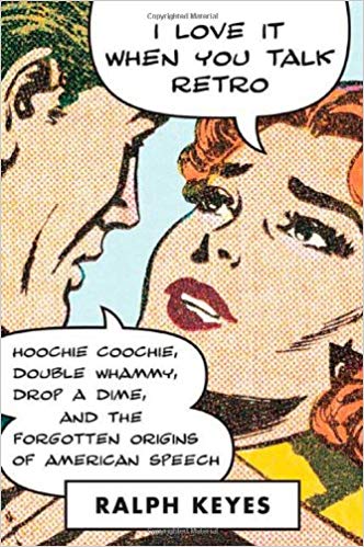
A 2009 nonfiction book by Ralph Keyes called I Love It When You Talk Retro announces its content right on the cover. The cover captures the look and spirit of Roy Lichtenstein who in turn captured the spirit of old comic books ‒ nice looking girl playing up to a guy who is eating up the female attention. Ralph Keyes has written other books about word origins and about euphemisms. The cover art is by Jason Ramirez. It is acknowledged that cover art is very important for the sale of a book, yet the identity of the artist is not shown prominently as it deserves to be. Even library catalogs leave out the cover artist.
The Dutch artist Theo Van Doesburg founded the art group called De Stijl (The Style) in 1917. He began a magazine to feature the group’s thoughts about a new pure form of abstract art as well as examples of that art. The typeface for the title was designed by Vilmos Huszar. Piet Mondrian, Bart Van der Leck, and others were founding members.

The title at the top is composed of rectangular bars fit into squarish form. Notice that Huszar took liberties with the name De Stijl. The i is made small and lifted, the hook of the J appears as a small horizontal bar, and the dot for the i seems to have drifted over to the top right corner. The i and j stylization has produced a y shape that looks fine to English readers. Perhaps the ij combination in Dutch is the equivalent of the letter y in English. That kind of equivalence is not unusual in English and German.
The Dutch language at the bottom announces that it is a monthly magazine of the modern by editor Theo Van Doesburg and co-writers on interior design.
What about the cover image which looks like a screen print? Some of the members of De Stijl were architects and the figure looks like a stylized building. The painters, especially Mondrian, painted using horizontals and verticals, avoiding diagonals and curves. This cover does the same.
Works by Mondrian and Van Doesburg were seen in the grid art chapter but this is an opportunity to look at a fun painting by de Stijl member Bart Van Der Leck. Can a portrait be made while keeping to the spirit of De Stijl practice? Yes, if the viewer interprets and fills in as required.
Did the artist adhere to only primary colors plus gray and black? Are the elements all polygons and arranged along horizontal and vertical lines? Does the image improve as you go further away? Does this man have an empty feeling?

We have to stop here because our topic at hand is book covers, but as an aside, you might enjoy seeing furniture made by another De Stijl member Gerrit Rietveld. His chairs are common, but his chair, night table, and bed combination form an oddly cozy ensemble. They were made for each other. You can find them by Google search phrase ‒ Gerrit Rietveld bed.
Comments
Post a Comment
You are invited to comment if you wish.